Tag Archives: graphic design

The Screen Is The New Hymnal: 3 Steps To Better Worship Slides

While Kristen and Bobby take a brief time away from blogging,  several guest bloggers will appear here at MySongInTheNight.com. Today, welcome Chris Bennett. Chris is Director of Media for Sojourn Community Church. He is also a graphic designer and a banjo player for Sojourn Music.

The screen is the new hymnal. This is both amazing and horrifying.

Amazing because you can now introduce a new song with a few clicks instead of obtaining a new hymnal, but horrifying because now anyone can design their own digital hymnal. Trained professionals typeset hymnals. Most worship slides don’t enjoy such luxury.

The design of worship slides may not seem like a big deal. But, second only to their Bible, they are the most important thing people read on a Sunday.

Consider this quote, but replace “book” with “slide”, and you have the goal of worship slides:

“The real work of a book designer isn’t making things look nice, different, or pretty. It is finding out how to put one letter next to another so that an author’s words seem to lift off the page. Book design doesn’t delight in its own cleverness; it is done in the service of words.” – Richard Hendel, On Book Design.

Worship slides should not look cool; their job is to make the words of the songs lift off the slide. People don’t hum and sing swirling neon slide backgrounds throughout their week, but they do hum and sing the songs they heard on Sunday. Our job is to make the words they sing as easy to read and remember as possible.

With that in mind, here are three simple steps toward that end:

Make Slides As Boring As Possible

Yes. Boring. Ditch the swirling colors, the butterflies, the hip grungy backgrounds, and the serene cabin in the woods. Default to a black background with light type, or a white background with dark type, and be proud of it. Hymnals, bibles, and books written for adults look plain on the inside for a reason. The Hip Teen Super Study Bible is the one that looks “cool” on the inside. Design for the masses, not the teenagers.

Pump Up The Font Size

Your text is probably too small. Your main text should be no smaller than 30pt. Your grandmother doesn’t complain if the font is big. She will if it’s too small.

Use A Decent Typeface

If anyone thinks the font you chose looks awesome, you chose the wrong font. If anyone besides graphic designers even notices your font choice, you chose the wrong font. Again, the goal is to lift the words off the slide and be boring. Use a sans-serif typeface such as Helvetica or Frutiger. Or, a serif typeface such as Garamond, Minion Pro, or Jenson.

Why You Should Think Outside The Box With Church Graphic Design

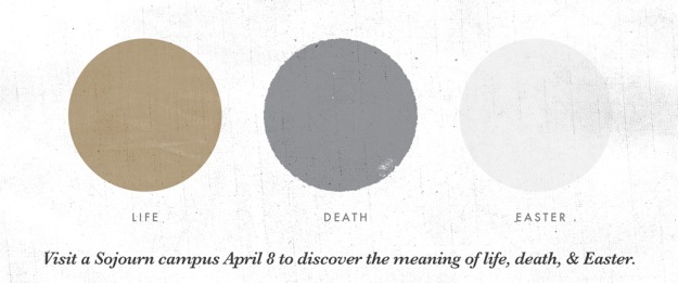
Church Graphic Design for Easter services at Sojourn Community Church, by Chris BennettMention “church design” to most people in the graphic design community and you’ll elicit a round of groans and eye-rolling. And with good cause. Churches are famous (or infamous) for using clip art, cliches and badly dated conventions.

I’m thankful at Sojourn that our pastors “get” (and even champion) creative design. I’m thankful that we have fabulous graphic designers like Bryan Todd, Michael Winters, Tyler Deeb and our many volunteer liturgical artists who are part of Sojourn Visual Arts. And I’m thankful for our Media Director Chris Bennett, who (among other things) lays out and designs our Sunday Bulletins and many pieces of art for our Lead Pastor Daniel Montgomery.

This Easter, Chris designed a simple, artistic Invite Card for our Easter Sunday services. You can see the  logo at the top of this post (in our web banner version of the card). I was thrilled to receive the following comment in an email, which was reflective of the feedback we received about the Easter art:

My wife invited one of her co-workers today with the Easter Invite card and her co-worker said: “Wow this is really different than I thought it would look. It looks artistic. I thought there would be a gigantic cross on it or something.” And she meant that in a positive way.

Obviously we have nothing against using the cross in graphic design, having done so many times. But we do try Continue reading

Church Graphic Design: See Sojourn’s 2011 Event Posters

Web banner advertising Christian Baptism serviceSojourn Community Church is blessed to have Bryan Patrick Todd among our members. Besides being a dedicated brother in Christ, he’s a talented freelance graphic designer here in Louisville and around the U.S.

Not only can you check out his portfolio anytime at bryanpatricktodd.com, but he’s recently published a blog post  with thumbnail views of all the posters he designed for me at Sojourn last year. If you’re interested in graphic design or church communications, take a couple minuted to check them out.

How To Take Charge Of Your Church Events Bulletin

Sojourn Church Pulpit Communications Team photo: Michael Winters, Amanda Edmondson, Daniel Montgomery, Bobby Gilles, Chris Bennett

Sojourn Sunday Communications team: Michael Winters, Amanda Edmondson, Pastor Daniel Montgomery, me & Chris Bennett

If I had a dime for every time a pastor or church Communications Director complained about ugly, cumbersome, divisive church bulletins I would be rich (because I would invest those dimes in anything but the music industry).

I’ve heard horror stories of weekly staff meetings where ministry leaders compete for space on the Sunday bulletin to promote their events and volunteer needs. I’ve seen bulletins with page after page of redundant or unnecessary information:

  • Name/title/phone #/email of 50+ church staff members
  • Upwards of 100 upcoming events and classes
  • Trivial “facts” about the pastor/member of the month
  • Graphics that add clutter, not clarity
  • “More info online here” URLs far too long to expect most people to type them

And more, sometimes in multiple typefaces (gotta have Comic Sans for the children’s ministry info, of course).

Our Sunday Bulletin at Sojourn is one 8.5 x 11″ page, folded down the middle to make a front & back cover and two inside pages. The front cover is reserved for liturgical art and the current sermon series logo. The art changes weekly, and fits the aesthetic of the logo. On the inside pages we print the week’s sermon Bible texts and the pastor’s brief outline (with plenty of space for guests and church members to write notes).

Old Sojourn Church Sunday Bulletin Design

Too much going on here ...

But today let’s talk about the back page. This is where we print the stuff that is so troublesome to many church leaders: the announcements and information. Continue reading

Does Your Church Need To Rebrand? Need To Know How?

Sadness 90/360 by Sasha Wolff used via Creative Commons license (photo of a child with tear)

Oh, it's difficult. You'll probably cry a few times

Several people have asked my opinion on how difficult it would be to “rebrand” a church — change the name and/or the logo and relaunch as if you were launching a new church.

Very difficult.

But this depends on many factors, including the length of time you’ve been in existence, the degree of opposition within your church membership, and other variables (not the least of which would involve finding out how poorly your current brand is perceived and how skillfully you can create a new brand identity and new branding deliverables).

Before I offer up anything new, check out these three things:

1 Samuel 4:1-22 from Southern Seminary on Vimeo.

Still with me? Okay, then lets talk about Coherence. 

Dr. Moore mentioned the rebranding of Sugar Pops in his sermon. Mothers are more comfortable buying Corn Pops for their children because it sounds healthier. But Sugar Pops is Corn Pops. It’s the same thing.

Don’t do this as a church. Don’t use branding signals to tell your community that you’re something you’re not. It won’t work, and people will call you a liar.

The marketing business has a saying: “Good marketing will kill a bad product faster.” Continue reading

Graphic Design Challenge: Communicating Money & Church Tithes & Offerings

Sojourn "God Gave" liturgical art display for sermon series on money and giving

Sojourn "God Gave" liturgical art display

A few weeks ago my church Sojourn embarked on a short sermon series on money, generosity and giving. Church leaders know this is one of the biggest communication challenges we have. Frankly, the Bible calls us to give generously because of God’s lavish gifts to us: salvation, right-standing with Him, and a place at the King’s table. Yet churches often either avoid the subject for fear of seeming money hungry, or they preach it in ways that induce guilt-inspired giving rather than giving in thanks and joyfullness.

Rebecca Elliott and I faced this challenge when we wrote Sojourn Music’s modern hymn of offering, “All I Have Is Yours” from the Before The Throne album.

More recently, Sojourn’s pastors taught a sermon series entitled God Gave (check out Sojourn’s God Gave sermon audio here).

We wanted church graphic design that would stimulate interest and cause people to think. Lead Pastor Daniel Montgomery’s pulpit team, of which I am a member, researched and brainstormed ideas for a few weeks. Art Director Michael Winters imagined the winning graphic design concept — dollar bills in the shape of the cross, on the stage backdrop of each Sojourn campus.

Pastor Daniel worried that it might be unnecessarily offensive, but decided that while some might find it offensive, it’s not unnecessarily so. Our culture’s view on money is far from God’s view, so “playing safe” with the God Gave graphic design would undermine our desire to challenge this modern, ungodly view.

Artist’s Statement (Michael Winters) Continue reading

Church Graphic Design: Telling The Baptism Story Through Visual Art

Banner version of Sojourn's Baptism Sunday graphic, by Bryan Patrick Todd

Banner version of Sojourn's Baptism Sunday graphic, by Bryan Patrick Todd

At our church Sojourn, we make a big deal about baptism. Because God does. Even Jesus insisted that John baptize him, and we all know what happened then. The Holy Spirit descended like a dove, and the Father said

“This is my Son, whom I love; with him I am well pleased.” (Matthew 3:17)

At Sojourn we hold a “Baptism Sunday” once every two months, and we continuously make people aware of the next date, through:

  • Sunday stage announcements
  • Sunday printed bulletins
  • Weekly Email from campus pastors
  • Campus website event calendars
  • Weekly “Baptism Testimony” posts on TravelBlog, the official blog of Sojourn Church
  • Social media
  • Announcements in our community group meetings
  • And our church graphic design collateral, such as web banners, posters and PowerPoint slides.

Meanwhile, our baptismal candidates write out their testimony of salvation with the help of our pastors (for more on how to write a personal testimony, click here). During Baptism Sunday, we all hear the testimonies, witness the baptisms, and we party “like its 1999,” to quote a Prince lyric.

Baptism Sunday poster version, in restroom. Don't laugh - restrooms are great places for poster of church events

Poster version, in restroom. Don't laugh - restrooms are great places for posters of church events

I asked our graphic designer Bryan Patrick Todd (see his freelance work here) to write a statement about how he created the poster and web banner we use to promote our Baptism Sundays on our campus websites and in our church buildings. Don’t underestimate the importance of visual art in promoting and telling the story of God’s work through your church — some people learn and receive stimulation through visuals more so than through text.

Bryan’s statement may help you think about how to visually promote the importance of baptism at your own church, or to understand the Continue reading