Tag Archives: church communications

How To Embrace Change While Holding Onto Your Core

“Every leader needs to etch some things in granite (never-change core) and write some things in sand (must-change methods). The problem is that when we fail to clarify and nurture things written in granite, our people get too attached to the things written in sand …

“The leader’s role is not just to communicate in both granite and sand but to show how the two components work together. The leader should help people embrace change by nurturing an emotional connection to the unchanging core vision.”

Church Unique: How Missional Leaders Cast Vision, Capture Culture, And Create Movement, by Will Mancini

Church leaders often struggle to discern granite from sand. We see it in church communication, in worship music, in evangelistic tools and methods. As much as we might have trouble seeing it — or as much as we may not want to see it — here are some things that may prove to be sand:

  • Facebook
  • Your blog
  • Guitars
  • Verse-Chorus-Bridge songs
  • Sunday School
  • Trunk-or-Treat

Some of these may prove to be sand within the decade. Others may prove to be sand within the century, or three centuries from now. Regardless, our core values and vision, stemming from the gospel, must drive everything.

The Flaw In Your Church Communication Strategy

“In most communication models, there’s a speaker and a listener or sender and a receiver. At our churches, many of us are accustomed to playing the role of the speaker, the communicator. Let’s do what we can to wear the other hat as often as possible. When we do, I bet we’ll learn a lot about what’s working, what’s not and why. I bet we’ll be inundated with ideas for new strategies, new channels and new messages. Frankly, that shouldn’t come as much of a surprise — many of our best ideas come when we decide to listen.”

— Scott McClellan (@ScottMcClellan), “Never Trust A Skinny Chef,” from Outspoken: Conversations On Church Communications

  • Pastors and church Communications staff, how are you listening to your members and attendees?
  • Worship leaders, how are you listening?
  • Songwriters, what about you?

All communicators need to listen.

My dear brothers and sisters, take note of this: Everyone should be quick to listen, slow to speak and slow to become angry,” – James 1:19

“To answer before listening—
that is folly and shame.” – Proverbs 18:13

Attractional Versus Missional Online Communication Strategies

In the church world, two outreach models have sometimes warred against each other.

The Attractional model says “Come and see.” It advocates for a well designed church building, top-notch Connect/Guest Services ministry, good signage, an excellently executed worship service and other well run programs and events. The point is to draw people in.

The Missional model says “Go and tell.” Instead of primarily drawing people to a specific location, the emphasis is on going into the community, living out the gospel in your everyday interactions, participating in the life of your city, using whatever gifts and interests God has given you: visual arts, sports, community planning, music. You’re a missionary, taking the gospel to your neighborhood, your favorite coffee shop, your circle of Little League parents, your local Farmer’s market.

In recent years many church leaders have said, “It’s not either/or; it’s both/and,” while others remain in one camp or another. But even a missional community may succumb to an “attractional only” online presence, and vice versa. Meanwhile, the “both/and” churches may invest more on one side or the other online, without knowing it. Lets look at how popular online tools fit within the missional/attractional models. These apply not only to churches but to businesses, bands, authors, and any other type of brand.

Attractional Online Strategy

Your website is the cornerstone of an attractional web strategy. An attractional-heavy strategy places all or most of your eggs in this basket. Your site looks attractive, it loads quickly, it provides incentives for people to visit and to linger. It contains all the info anyone would want to know about you (see my The Biggest Mistake On Your Church Website Homepage here).

Let’s look at some of the attractional elements we’ve built into My SongIn The Night. Obviously, our blog is front-and-center because we post new content at least twice a week. We’ve also embedded a free offer for Kristen’s worship EP The Whole Big Story in the right-hand column. And by clicking the Streampad “Click To Play All Posts” bar at the bottom of this site, you can freely listen to all our worship songs, including the ones recorded by Sojourn Music.

Podcasts are attractional as well. Many people love to subscribe to fun or thought-provoking podcasts. And of course don’t forget videos.

Missional Online Strategy

Social media networking is the ultimate missional strategy. Instead of pulling people to a website, you go where they are: Facebook, Twitter, Instagram, Google+, LinkedIn and whatever social network contains an audience with whom you’d like to connect. See my E.E.R.I.E. system of social media networking here, Social Media For Churches here and my Social Media Marketing for bands here.

But not so fast! Even if you want to be missional, you can fall into an attractional mindset on social media. Lots of brands spend much time and money customizing their Facebook page to the fullest extent Facebook allows. They treat their Facebook page like a website. And that’s fine if you’ve got the resources for it.

But Facebook users are far more likely to engage you when they see your updates and photos on their Timelines, not on your brand page. Many of those who like your page only go there one time (when they initially click “Like”). Remember, you have to create compelling content and engage with people. The same goes with Twitter — most of your Twitter followers will not visit your Twitter.com home page — they’ll only see your tweets. The coolest looking Twitter profile in the world won’t do you any good if you’re not engaging and reciprocating with your followers.


Three Questions For Determining Your Church’s Vision

Untitled
In Steering Through Chaos: Mapping a Clear Direction For Your Church in the Midst of Transition and Change, Scott Wilson writes about asking his church staff and board three questions:

  1. What do we do exceptionally well?
  2. What are we passionate about?
  3. What are the demographics of our community?

It’s all about vision clarity. It’s not enough to come up with a catchy “vision statement.” You must think through these questions, and pray relentlessly for your church’s unique vision to live the gospel in your unique setting.

Although all churches should preach the gospel in word and deed, not all will do exceptionally well at the same things. Nor will the demographics of our communities all be the same. And we don’t even necessarily have to be passionate about the same things.

  • Maybe the church down the street from you has the best food bank in the city, because their people are passionate about it.
  • Maybe the church two blocks away are particularly passionate about reaching and welcoming artists, or athletes, or the elderly.
  • Maybe your church is most passionate about being a place of gospel-driven healing.

And maybe, by God’s grace, you’re great at it. And maybe there are a lot of people in your community who need healing: emotionally, spiritually and physically. Sounds like the makings of a compelling vision, doesn’t it?

Photo by Sojourn Communication’s Intern Chelsey Scott

The Biggest Mistake On Your Church Website Homepage

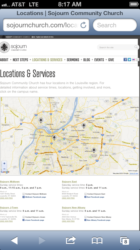
Locations and Service Times page for Sojourn Community Church website (sojournchurch.com)Churches, unfortunately, make a lot of mistakes on their websites — particularly the home page: For instance:

  • Cheesy clip art
  • Photos of smiling faces … who have never actually been to your church
  • Sensory overload – every bell and whistle that every staff member could dream of

But one issue flabbergasts me. I can’t tell you how many church websites I’ve visited that had one certain problem. And this isn’t a matter of including the wrong thing on your home page. It’s about what some of you are leaving out:

Your Location And Service Time(s)

Your church website is like your billboard, and like the old Yellow Pages listing. People may be checking out your website for lots of things, but for sure you need them to know where and when you meet. Don’t make them hunt all over your website to find this information.

Include contact information too — email, office phone number and your major social media accounts.

The Multi-Campus Conundrum

What if you’re a multi-site church? What if it’s not feasible to include the street address and service times for every campus on your home page?

We had this problem at Sojourn Community Church, where I am Director of Communications. Our solution was to create a major tab header called Locations And Service Times. This is one of several main headers that appears on every page of our site, not just the home page. Clicking on our Locations And Service Times tab takes you to a page with complete listings for each of our four campuses, as well as a customized Google map of the entire Louisville/Southern Indiana area, with markers showing each of our campuses.When users click on a marker, they can get directions to that campus from their own address.

If you’re a multi-site church, have you chosen another way to communicate your individual campus service times and locations?

Include Your City

Some church websites list their street address but not their city or even state. The reasoning might be, “People in our town already know what town they’re in. They just need our street address.”

The first problem with this is you’re shooting yourself in the foot with Google and other search engines. For instance, if you’re a church in Boston, you want people to be able to type “Boston churches” into a search engine and find you. Make sure you mention Boston on your website.

The second problem is that we live in a mobile society, where people move often and where they have friends and family in many locations. So let’s say I am looking at a church website — maybe I arrived there from a link on Twitter (a friend posted the link to the most recent sermon by this church’s pastor). The sermon is great and the website leads me to believe this is a good, gospel-centered church.

Then I notice the church is located in Cedar Rapids, Iowa. No way! I was just talking to my cousin on Facebook, who is moving to Cedar Rapids next month and will be looking for a home church. Now I can send her the link to this church website.

But what if “Cedar Rapids” wasn’t listed on the site, or at least wasn’t listed on any main page? What if the only address listing was “123 Main Street”? There is a 123 Main Street everywhere. Now my cousin still doesn’t have a head start on finding a good church in Cedar Rapids.

Not good.

The Screen Is The New Hymnal: 3 Steps To Better Worship Slides

While Kristen and Bobby take a brief time away from blogging,  several guest bloggers will appear here at MySongInTheNight.com. Today, welcome Chris Bennett. Chris is Director of Media for Sojourn Community Church. He is also a graphic designer and a banjo player for Sojourn Music.

The screen is the new hymnal. This is both amazing and horrifying.

Amazing because you can now introduce a new song with a few clicks instead of obtaining a new hymnal, but horrifying because now anyone can design their own digital hymnal. Trained professionals typeset hymnals. Most worship slides don’t enjoy such luxury.

The design of worship slides may not seem like a big deal. But, second only to their Bible, they are the most important thing people read on a Sunday.

Consider this quote, but replace “book” with “slide”, and you have the goal of worship slides:

“The real work of a book designer isn’t making things look nice, different, or pretty. It is finding out how to put one letter next to another so that an author’s words seem to lift off the page. Book design doesn’t delight in its own cleverness; it is done in the service of words.” – Richard Hendel, On Book Design.

Worship slides should not look cool; their job is to make the words of the songs lift off the slide. People don’t hum and sing swirling neon slide backgrounds throughout their week, but they do hum and sing the songs they heard on Sunday. Our job is to make the words they sing as easy to read and remember as possible.

With that in mind, here are three simple steps toward that end:

Make Slides As Boring As Possible

Yes. Boring. Ditch the swirling colors, the butterflies, the hip grungy backgrounds, and the serene cabin in the woods. Default to a black background with light type, or a white background with dark type, and be proud of it. Hymnals, bibles, and books written for adults look plain on the inside for a reason. The Hip Teen Super Study Bible is the one that looks “cool” on the inside. Design for the masses, not the teenagers.

Pump Up The Font Size

Your text is probably too small. Your main text should be no smaller than 30pt. Your grandmother doesn’t complain if the font is big. She will if it’s too small.

Use A Decent Typeface

If anyone thinks the font you chose looks awesome, you chose the wrong font. If anyone besides graphic designers even notices your font choice, you chose the wrong font. Again, the goal is to lift the words off the slide and be boring. Use a sans-serif typeface such as Helvetica or Frutiger. Or, a serif typeface such as Garamond, Minion Pro, or Jenson.

How To Find Holes In Your Sermons, Songs & Communication Strategy

“In most communication models, there’s a speaker and a listener or a sender and a receiver. At our churches, many of us are accustomed to playing the role of the speaker, the communicator. Let’s do what we can to wear the other hat as often as possible. When we do, I bet we’ll learn a lot about what’s working, what’s not and why.”

— Scott McClellan, “Never Trust A Skinny Chef” from Outspoken: Conversations on Church Communication

  • Church staff, have you ever tried navigating your building just by reading your signage, as if you’d never been there before?
  • How about surfing through your church website? Can you find what you’re looking for?
  • Pastors and songwriters, are your words and lyrics intelligible? Do they present the gospel clearly, even to those who don’t know it well?
  • Worship leaders, can people of average singing talent follow your arrangements and sing your songs?

Be A Sojourn Church Communications Intern!

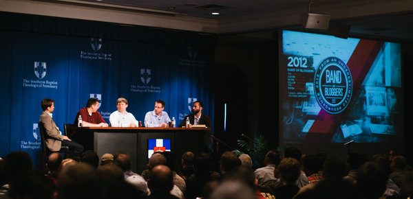
2012 Band Of Bloggers luncheon photo by Sojourn Church Communications Intern Chelsey Scott

Band of Bloggers seminar photo from 2012 Together for the Gospel Conference, taken by Sojourn Communications Intern Chelsey Scott

My church Sojourn has a robust internship ministry, headed by Pastor Jeremy Lineman. Interns learn through our theology/discipleship classes. They also serve the church through the specific ministry areas they choose. If this sounds good to you and if you have a background or interest in church communications, then apply by October 31 for the internships beginning February 1, 2013.

You’ll work with me (the Director of Communications) as well as Director of Media Chris Bennett, other interns, and the Sojourn communications team led by Lead/Founding Pastor Daniel Montgomery. Current interns include Chelsey Scott (photography, print layout/design) and Shepherd Ahlers (video/filmmaking). We’d be happy to have more interns in these areas. We’re also looking for interns in Web Maintenance (may include light web design work) and Social Media. Other possibilities include:

  • Writing & editing
  • Graphic design
  • Administration/clerical

Pastor Jeremy advises interns on how to raise the necessary financial support, and he and works to see that we holistically develop leaders for the church and the world through shepherding and practical ministry experience.

If you have any questions related to internships at Sojourn Church, please email us at internships@sojournchurch.com.

The Communication Secret Your Church Needs

Final Sojourn Community Church worship service At 930 Mary Street, "The 930 Art Center." Photo courtesy Matt Herp

From the final Sojourn worship service at 930 Mary Street

Too often, church communications is all about event promotion, whether that event is a new class, sermon series, vision campaign, retreat, seminar or outreach festival. Then when the event is over, we’re onto the next thing.

If you consistently promote events as “a huge opportunity” or “can’t miss,” but you say nothing about the event when it’s finished, then you are unintentionally communicating that the event wasn’t a big deal after all. Over time, people will be less likely to believe that future events are “can’t miss” because nothing in the past turned out to be as special as what the event promotion led them to believe.

This is why we’ve posted recaps, photo blog posts, and testimonies following Sojourn Church events like our recurring Redeem Marriage seminars, baptism services, Fall Festival, campus launches, medical clinics and other events. And it’s why we took time to look back, even in the midst of looking forward, when our Midtown Campus left its original building for a bigger one down the street.

The first building Sojourn owned was originally a school building, built in 1906. We bought it nearly 100 years later, launching services at “The 930” in 2006. In the years since then we’ve outgrown the Sunday worship space, so we bought a former Catholic cathedral named St. Vincent’s, just two blocks from The 930. We’ve spent the last year on a massive renovation project. The new St. Vincent’s looks amazing, and the seating capacity is double the capacity at The 930 (which will remain our central staff office building and our meeting place for student ministry).

We’ve spent much energy promoting the launch of services at this new building, but we knew something would be missing if we Continue reading

Is Your Church Offering Too Many Choices?

Too Many Choices Makes Consumers Less Likely To Choose AnythingIn her landmark church communications book Less Clutter, Less Noise: Beyond Bulletins, Brochures and Bake Sales, Kem Meyer of Granger Community Church writes:

“In theory, more choices may lead people to find exactly what they want. But, research shows people actually feel worse. Too much choice leads to one of three results: regret, shutdown or paralysis.”

And this is what contemporary churches often give their people:

  • Choices between “traditional,” and “contemporary” worship services.
  • Sometimes even a third choice, usually labeled something like “mosaic,” or “ancient-future.”
  • “Ministry Fair” styled choices between many affinity-based small groups.
  • Church bulletins and websites overloaded with information, some of which isn’t even related to the church
  • So many competing micro messages that the main message and vision of the church gets lost

In The Paradox Of Choice: Why Less Is More (How The Culture Of Abundance Robs Us Of Satisfaction), Barry Schwartz elaborates on the problem of too much freedom in the Western world. He provides case studies that back this thesis:

“A large array of options may discourage consumers because it forces an increase in the effort that goes into making a decision. So consumers decide not to decide, and don’t buy the product. Or if they do, the effort that the decision requires detracts from the enjoyment derived from the results. Also, a large array of options may diminish the attractiveness of what people actually choose, the reason being that thinking about the attractions of some of the unchosen options detracts from the pleasure derived from the chosen one.”

If you are old enough to remember, say, 1985, think about Continue reading